

Chocota - Packaging Design
A chocolate brand that is inspired by the forms of the tangram

Client
MK24
Duration
1 week
May 2020
Project Type
Personal Project
My Role
Concepting, Ideating, Graphic Design, Printing
Context
This project was part of a graphic design course I took at MK24 in Amsterdam. The assignment was to design something (anything was possible) using the shapes of a tangram. I decided to design a packaging design for a chocolate bar because I am a huge chocolate addict. In the end, I had it printed on thick paper and friends believed that this was an actual chocolate bar, that can be bought in the supermarket.
Approach
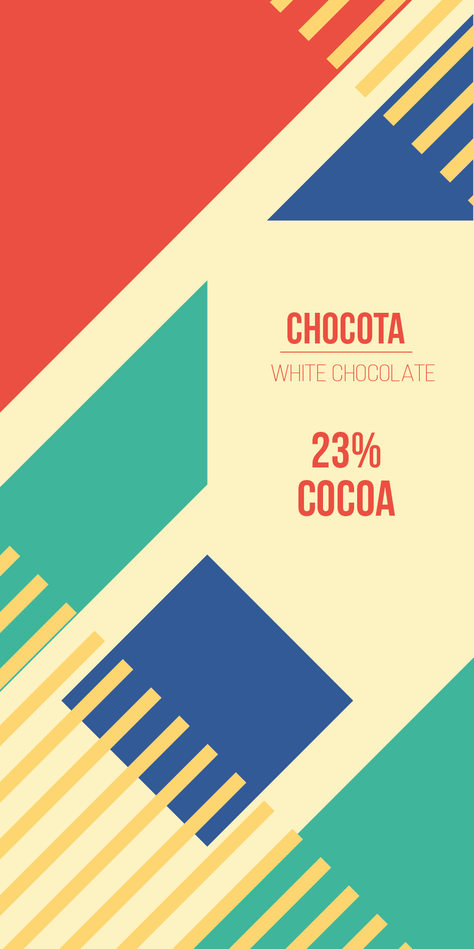
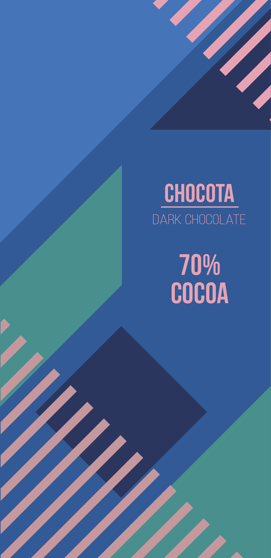
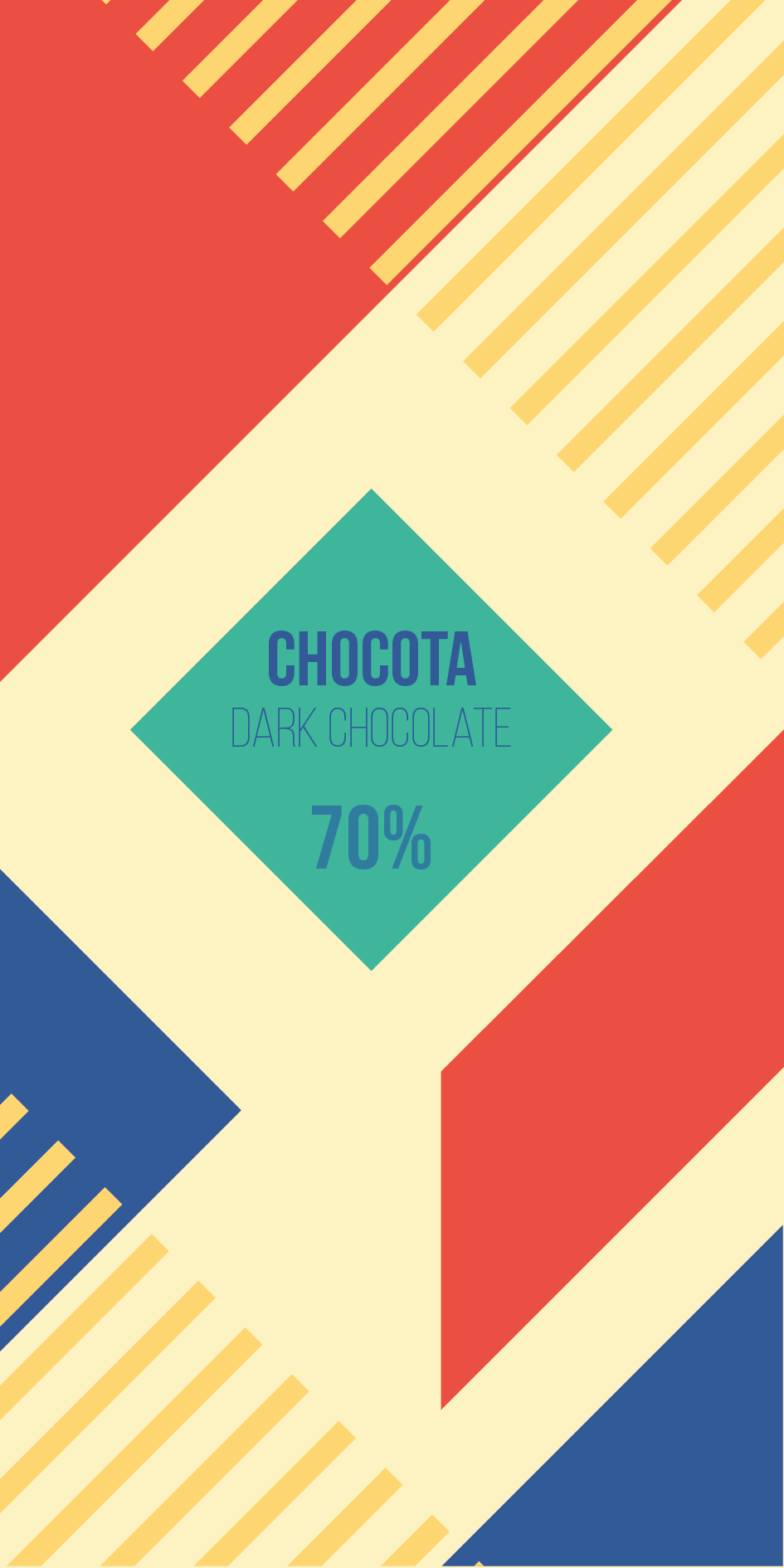
During the design phase, I tried out different color palettes and layouts, using all the shapes of the tangram and fitting them on the chocolate packaging. I also didn't want to scale any shapes of the tangram to make it fit better on the packaging. The whole process was about rearranging and testing out how different colors fit together. Below you can see different versions of the packaging design I came up with during the design process.
Final Design
Based on the feedback I received from my peers and teacher I decided to go with the design that is shown on the top. The feedback that made me choose the final design was, that most people associated the light version of the packaging with white chocolate and not with dark chocolate. Additionally, the dark blue design gave them a feeling of superiority over dark chocolate.